… and why is this a trick question?
The chart below shows the unrestricted net assets reported by the state governments of Illinois and New York from 2007 to 2016. Unrestricted net assets is a measure roughly similar to ‘shareholder equity’ in the private sector, marking what is left over after subtracting liabilities (stuff you owe) from unrestricted assets (stuff you have).
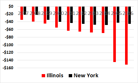
Unrestricted net assets are negative, and in the billions of dollars, in both Illinois and New York. The picture suggests, in turn, that things have deteriorated sharply in Illinois in recent years, while they have improved in New York, which is much better shape than Illinois.
But this is a highly misleading picture – even though it is based on “official” government accounting data.
Government accounting standards have finally begun to require state and local governments to reflect a “net pension liability” on their balance sheet. That liability is much bigger in Illinois than in New York, which is step one in interpreting the different fortunes apparently the case in the chart above.
But the shoe is on the other foot when it comes to unfunded retirement health care benefits. In New York, those benefits swamp unfunded pension assets. And the accounting standards have yet to require the formal presentation of those liabilities on the balance sheet.
That won’t be the case in coming years, and when those liabilities “officially” arrive, New York is going to drop much closer to Illinois, on this score.
Another reason why Truth in Accounting’s framework for our bottom-line “Taxpayer Burden” is worth watching. It takes an overall view of financial health, e.g. not just at pensions, and more importantly, has been calculated on a consistent basis since 2009 for all 50 states.
Our consistent measure gives us a chance to gauge trends in financial condition, as opposed to being misled by “official” metrics like those in traditional government financial statements. The chart above shows changes in accounting, not changes in reality.